 "RWS Motorsport" (rwsmotorsport)
03/09/2015 at 18:32 • Filed to: Photography
 0
0
 15
15|
"RWS Motorsport" (rwsmotorsport)
03/09/2015 at 18:32 • Filed to: Photography | 0
| 15 |
Evening/afternoon/morning everyone.
with the lovely community of automotive photographers on here, I wondered if anyone could offer me any tips. I've been playing with some of the presets on lightroom, and could do with some opinions of others, as to what sort of style you like, and any suggestions of things to try to make it better:
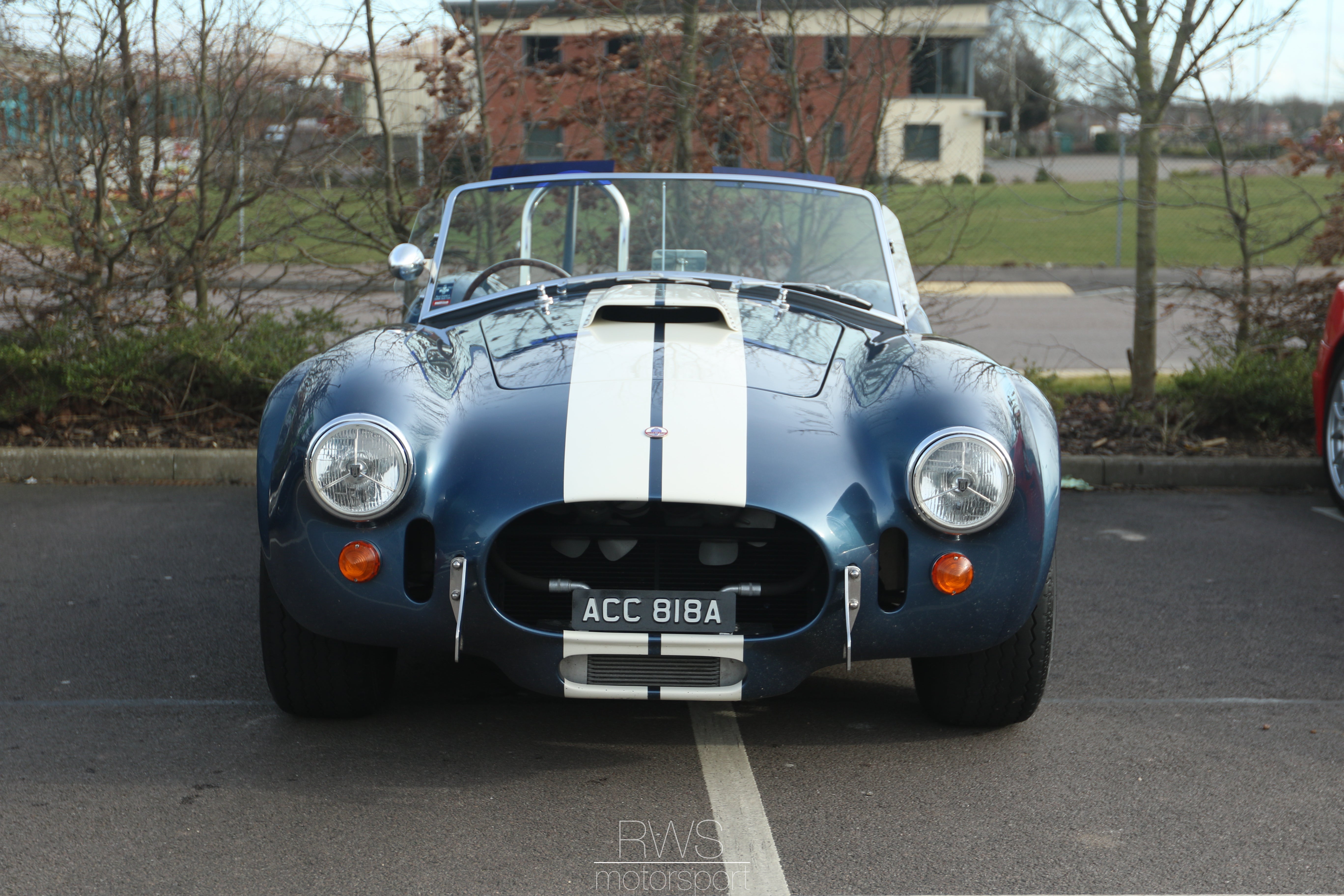
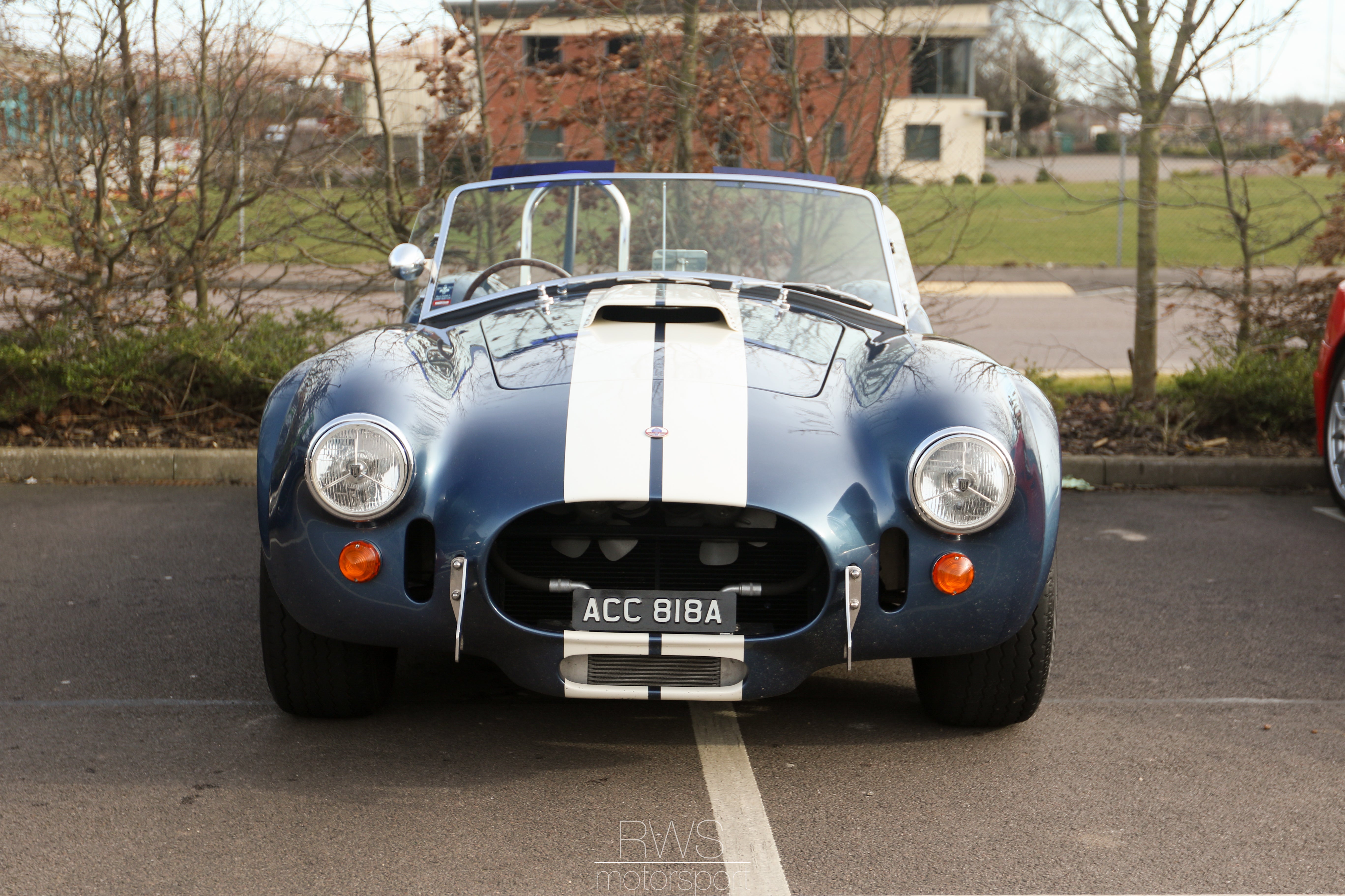
I have been playing with this cobra picture I took, as its not a bad picture, but its not particularly exciting.
Original photo:
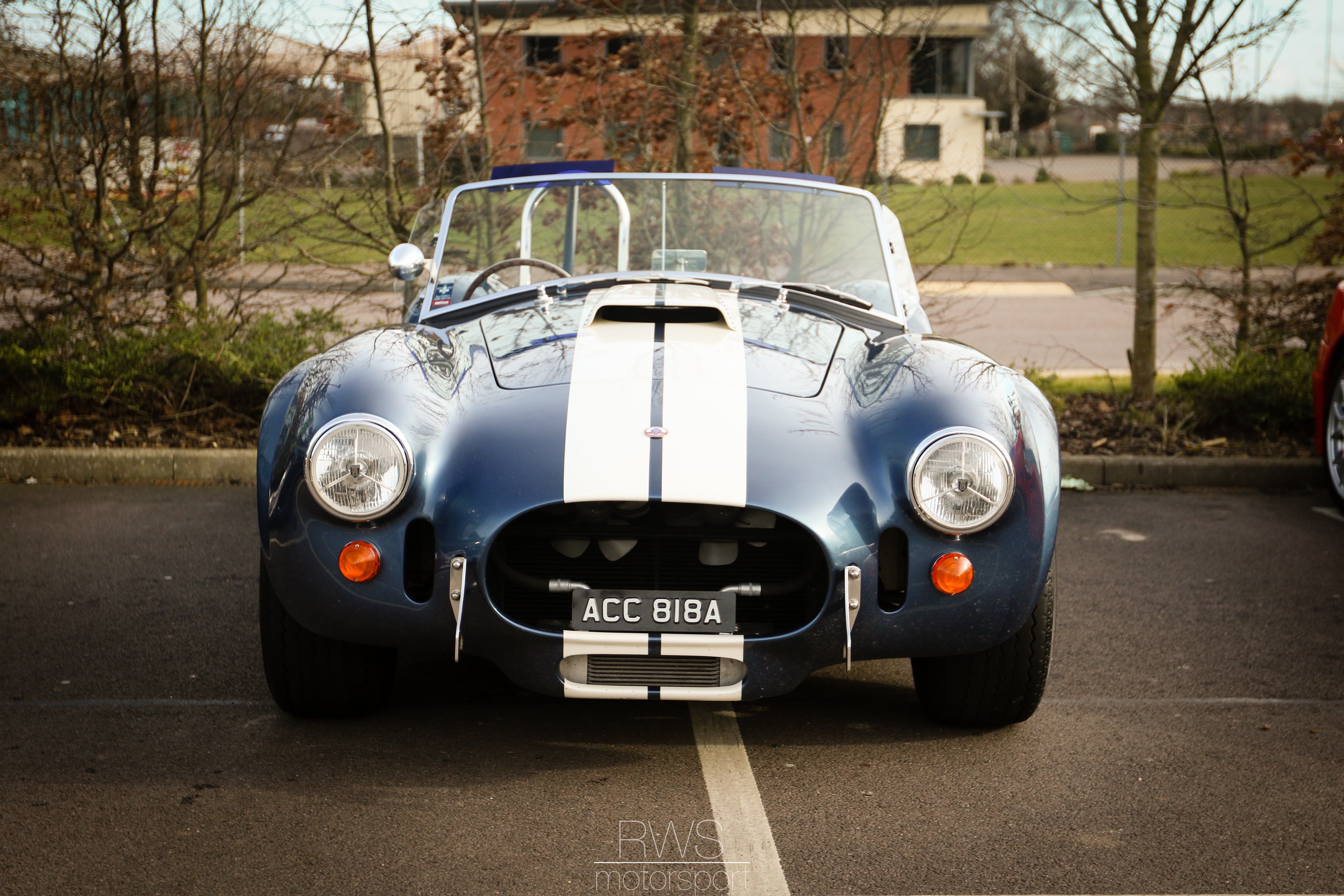
Medium contrast:
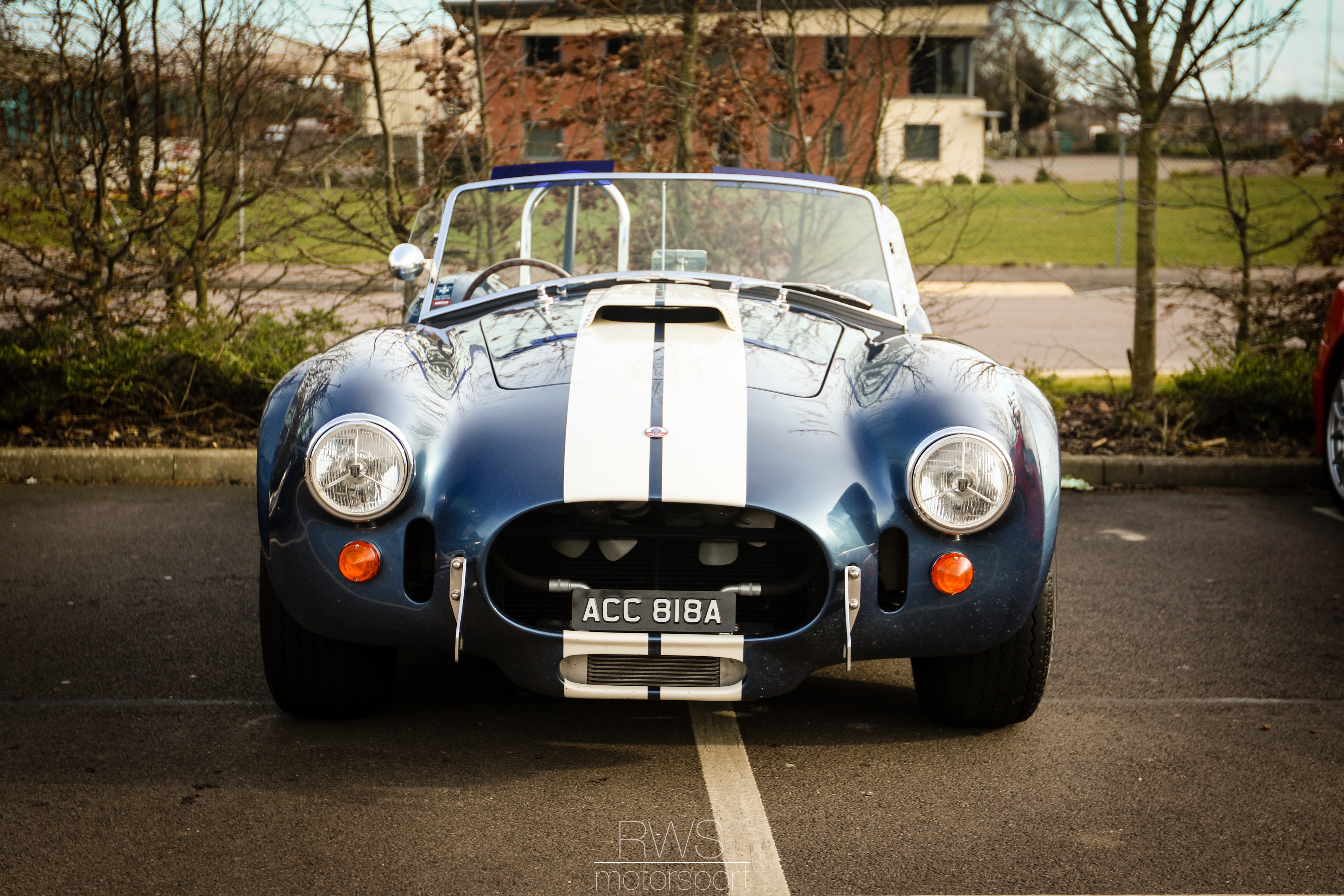
Punch: I quite like this, but I don't know if its maybe taken the picture too far from its original. its also got some Vignette applied, which i like as it draws you to the car.
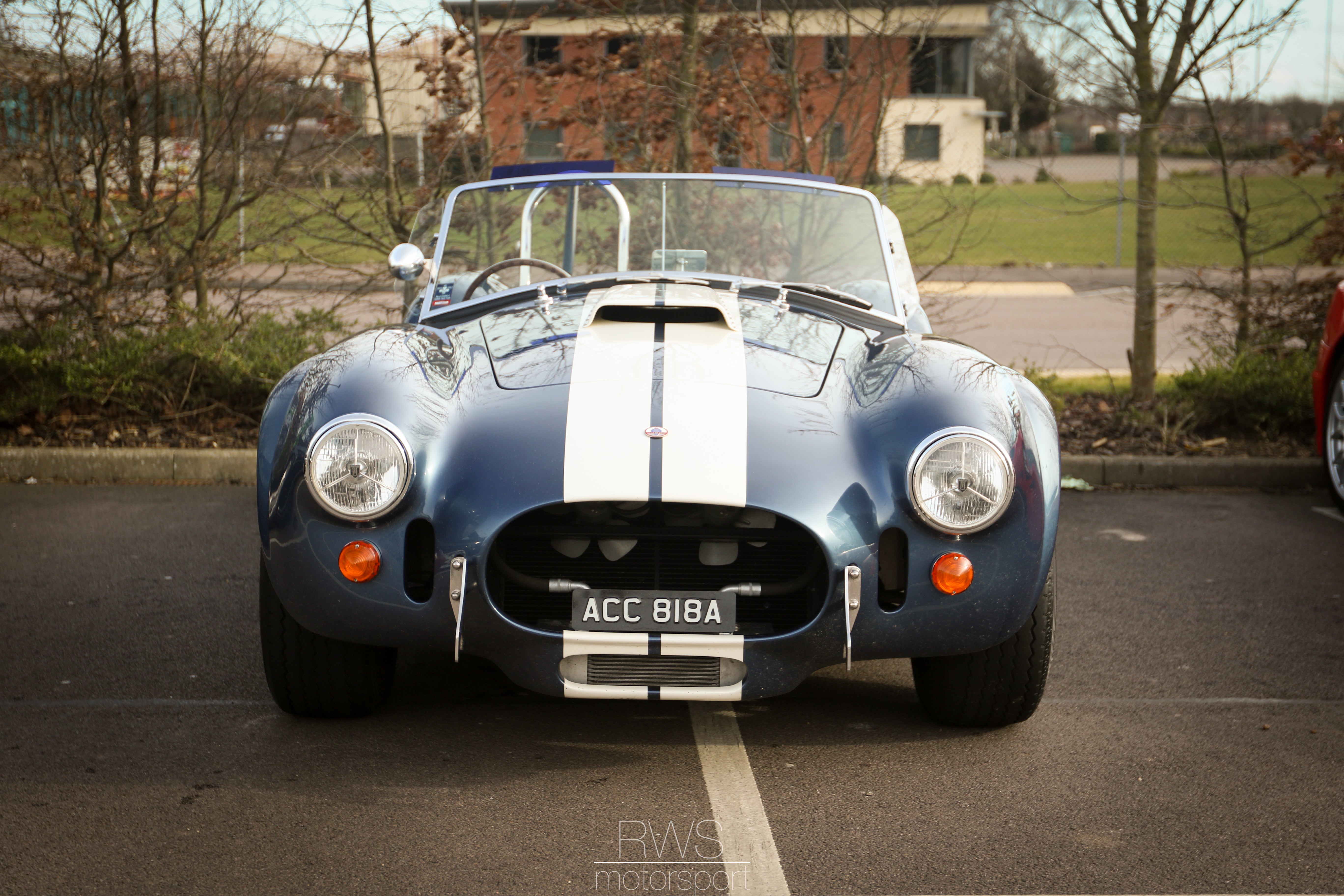
Less altered: Temperature, exposure corrected and mild vignette applied
just temperature and contract adjusted:
I don't know if the more heavily worked photos are overdone? whether i'm best of just leaving the photos alone completely, or whether the editing is making them better? so thoughts, comments and the like very welcome.
 Lumpy44, Proprietor Of Fine Gif
> RWS Motorsport
Lumpy44, Proprietor Of Fine Gif
> RWS Motorsport
03/09/2015 at 18:37 |
|
Will share to Photography, lots of good people there to help.
|
RWS Motorsport
> Lumpy44, Proprietor Of Fine Gif
03/09/2015 at 18:44 |
|
Thank you :) now theres a sub-blog i need to spend more time on
 JR1
> RWS Motorsport
JR1
> RWS Motorsport
03/09/2015 at 19:31 |
|
I'm no expert but the second to last photo is my favorite. The lighting highlights the car while still have some beilevable shadows fetchered.
 davvvvvvve
> RWS Motorsport
davvvvvvve
> RWS Motorsport
03/09/2015 at 21:19 |
|
I think the original photo would have been completely fine unedited IF the car was parked differently.
-Its not parallel with the white line on the ground; since its a straight on shot, it would look better if the car was parked straight.
-Also the background. It would help if the trees covered that building up. And it would REALLY help if the car was far enough from the trees to allow you to get them really out of focus. Everyone loves a blurry background.
-Lastly, what jerk parked their red car in your shot?
So my advice is this: next time, get the keys to the Cobra!
 Stephen the Canuck
> RWS Motorsport
Stephen the Canuck
> RWS Motorsport
03/09/2015 at 21:38 |
|
I like the second to last one the best as well. I would crop out the red car, and straighten out the Cobra.
The way I use Lightroom is to hit auto for the white balance and the tones, then adjust the sliders from there till it looks good. I like to move the vibrance and saturation sliders around a bit too.
|
Lumpy44, Proprietor Of Fine Gif
> RWS Motorsport
03/09/2015 at 23:21 |
|
Can give you authorship if you want too!
 Kevin Barrett
> RWS Motorsport
Kevin Barrett
> RWS Motorsport
03/10/2015 at 03:30 |
|
I like the original, maybe punch up the saturation a little, then add about half as much vignetting as the least vignetted picture above. Otherwise, the last picture in your set looks the best.
|
RWS Motorsport
> Lumpy44, Proprietor Of Fine Gif
03/10/2015 at 03:36 |
|
Oo yes please. That would be brilliant.
|
RWS Motorsport
> davvvvvvve
03/10/2015 at 03:38 |
|
Ah now thats the best kind of advice ha,
the aforementioned red car would happen to be a Ferrari 360 that was part of this convoy. I literally just stumbled across them whilst popping into a supermarket.
very good points all round though thanks, yeah a nicer backdrop would be lovely.
|
RWS Motorsport
> Stephen the Canuck
03/10/2015 at 03:41 |
|
Im liking that advice. thats my sort of default, is yeah hit auto for WB and Tone and tweak if i need.
The concensus seems to be Keep It Simple Stupid (KISS). keep the photo less overworked, but correct it abit.
|
RWS Motorsport
> JR1
03/10/2015 at 03:42 |
|
thank you, thats helpful :) its hard to tell sometimes when your doing it whether you have gone to far from what it started out as.
the second to last seems to be a pretty clear winner. relatively little done to it, just corrected and mildest vignette applied.
|
RWS Motorsport
> Kevin Barrett
03/10/2015 at 03:44 |
|
Awesome thanks :) another fan of the keep it simple and do less mucking around with it. seems to be a very good course of action.
|
JR1
> RWS Motorsport
03/10/2015 at 09:33 |
|
Relly well done hope to see more!
|
Lumpy44, Proprietor Of Fine Gif
> RWS Motorsport
03/10/2015 at 10:20 |
|
Comment on this post some place and I'll add you!
 Jonathan Harper
> RWS Motorsport
Jonathan Harper
> RWS Motorsport
03/11/2015 at 09:18 |
|
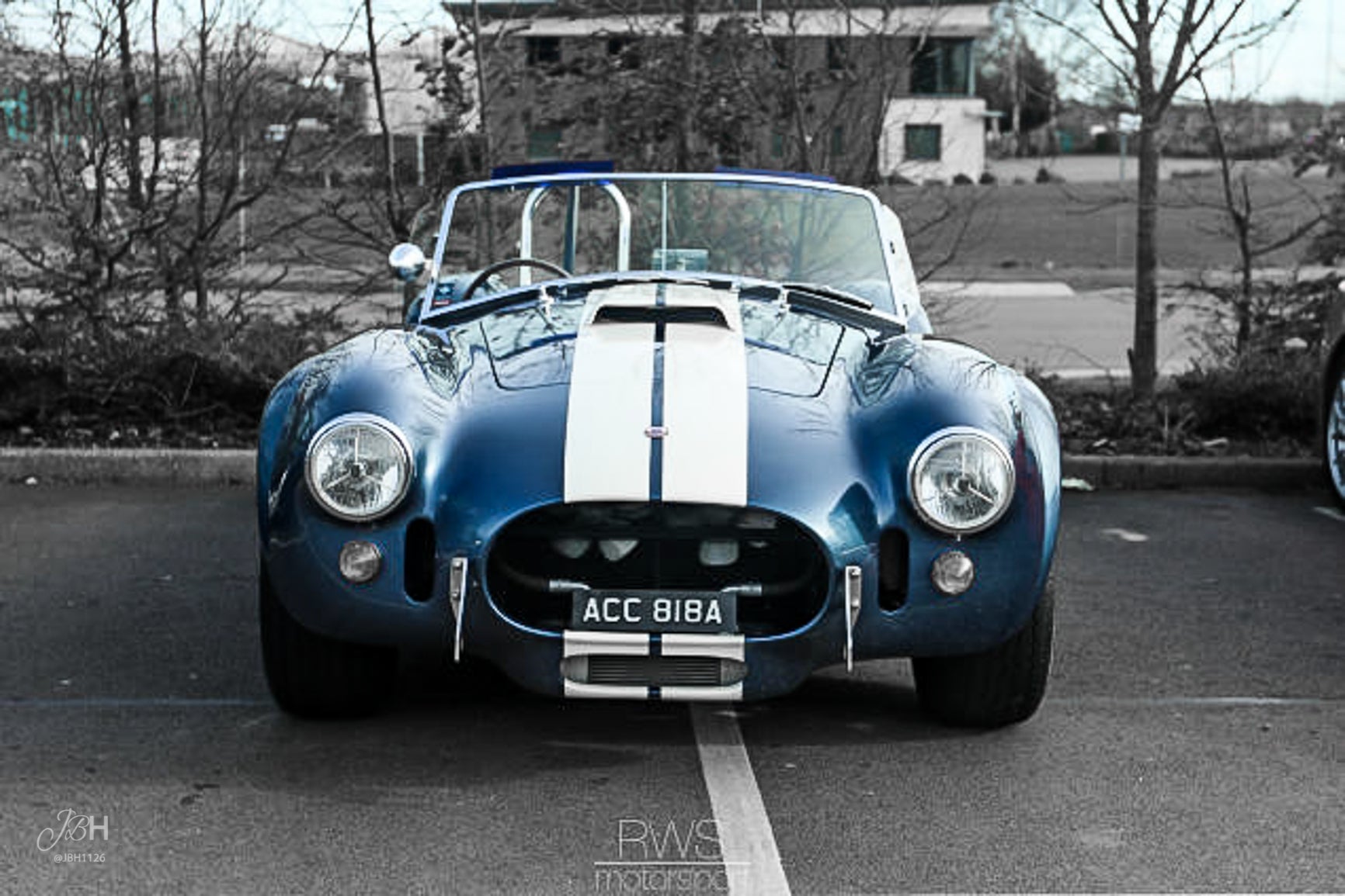
Hope you don't mind, I did a quick edit in lightroom. (oops didn't mean to put my watermark on there my bad)
I gave it a little more contrast, turned up the shadows just a bit, and gave it some clarity. I also desaturated the warm colors in the background.